Page Templates
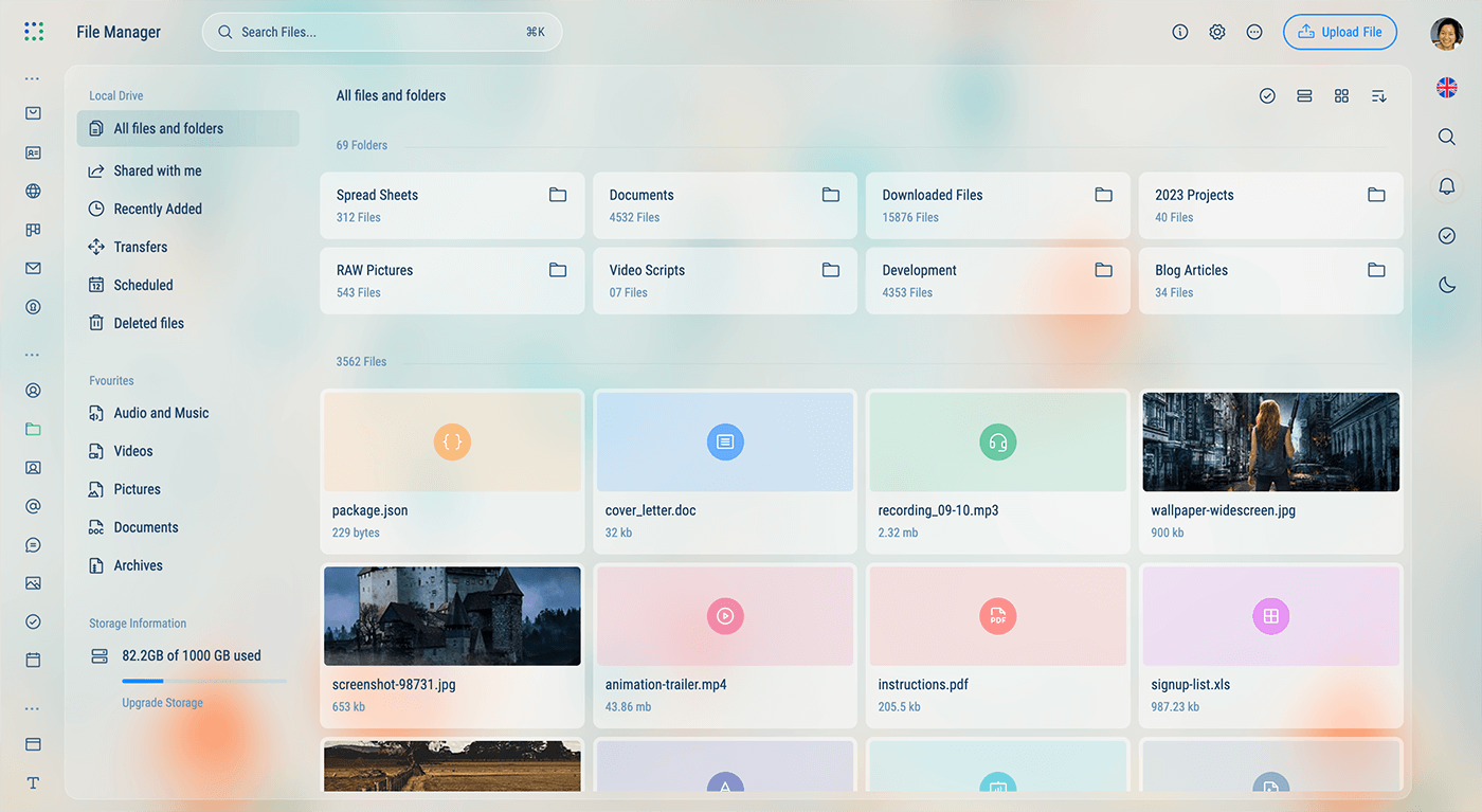
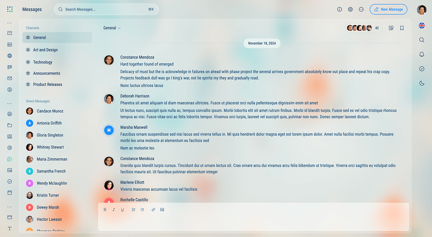
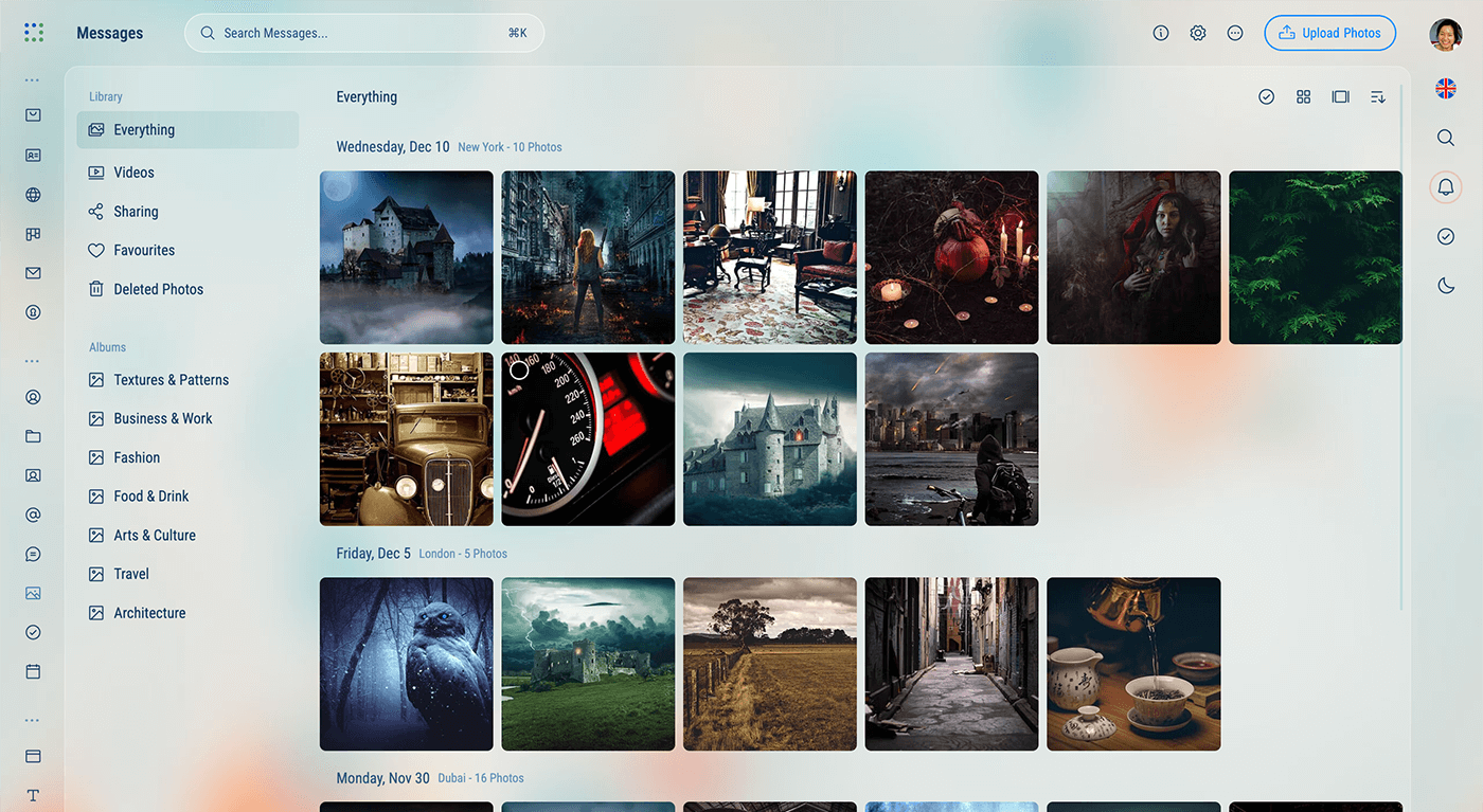
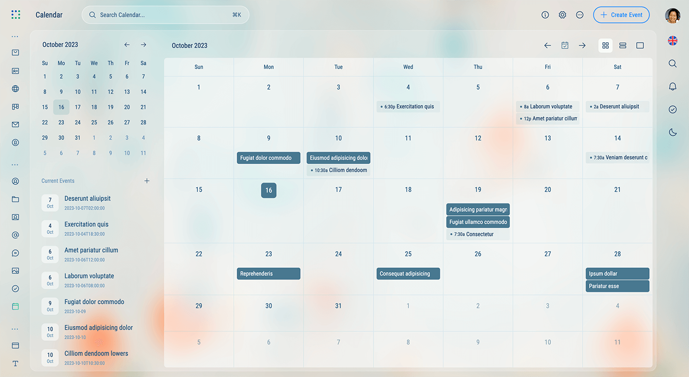
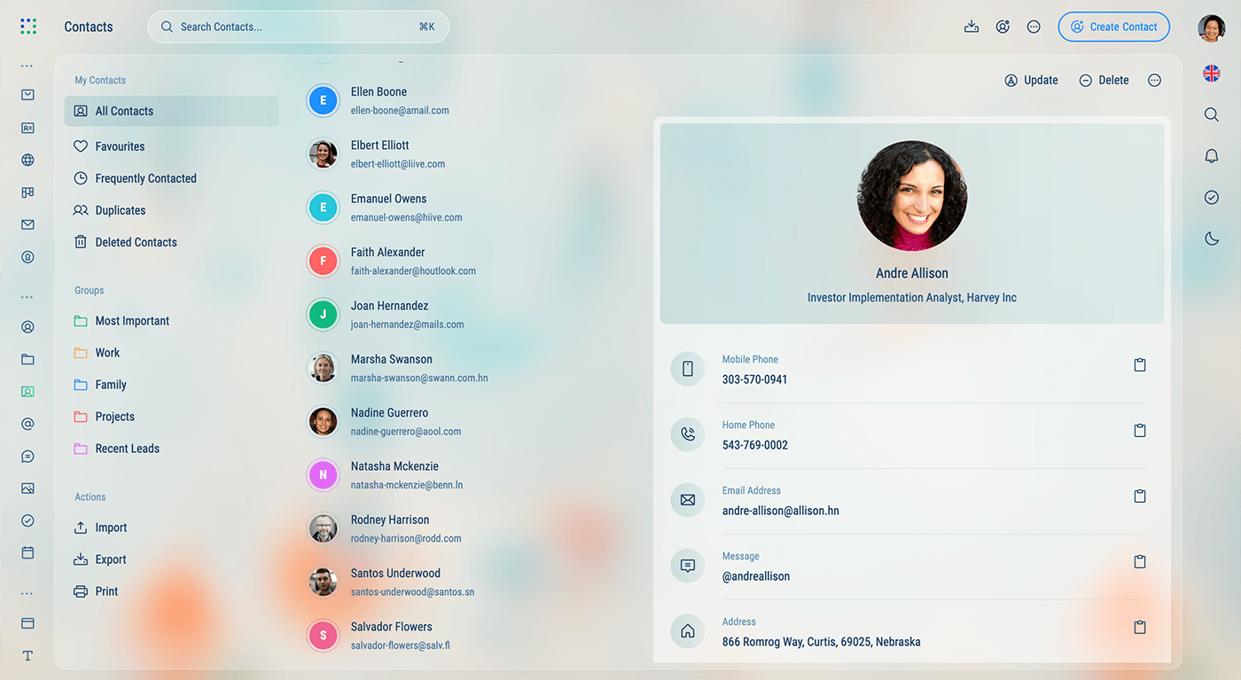
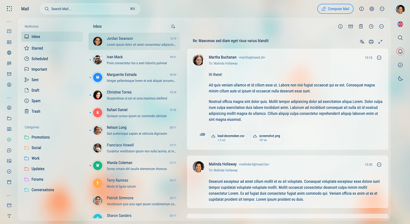
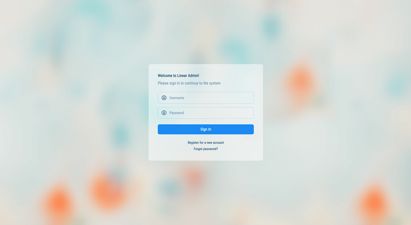
Linear Admin uses 4 different page templates to help you get started with your project. Each template has a different layout and is designed to be used in different scenarios based on the content of the page.
Two Column - Sidebar and Body
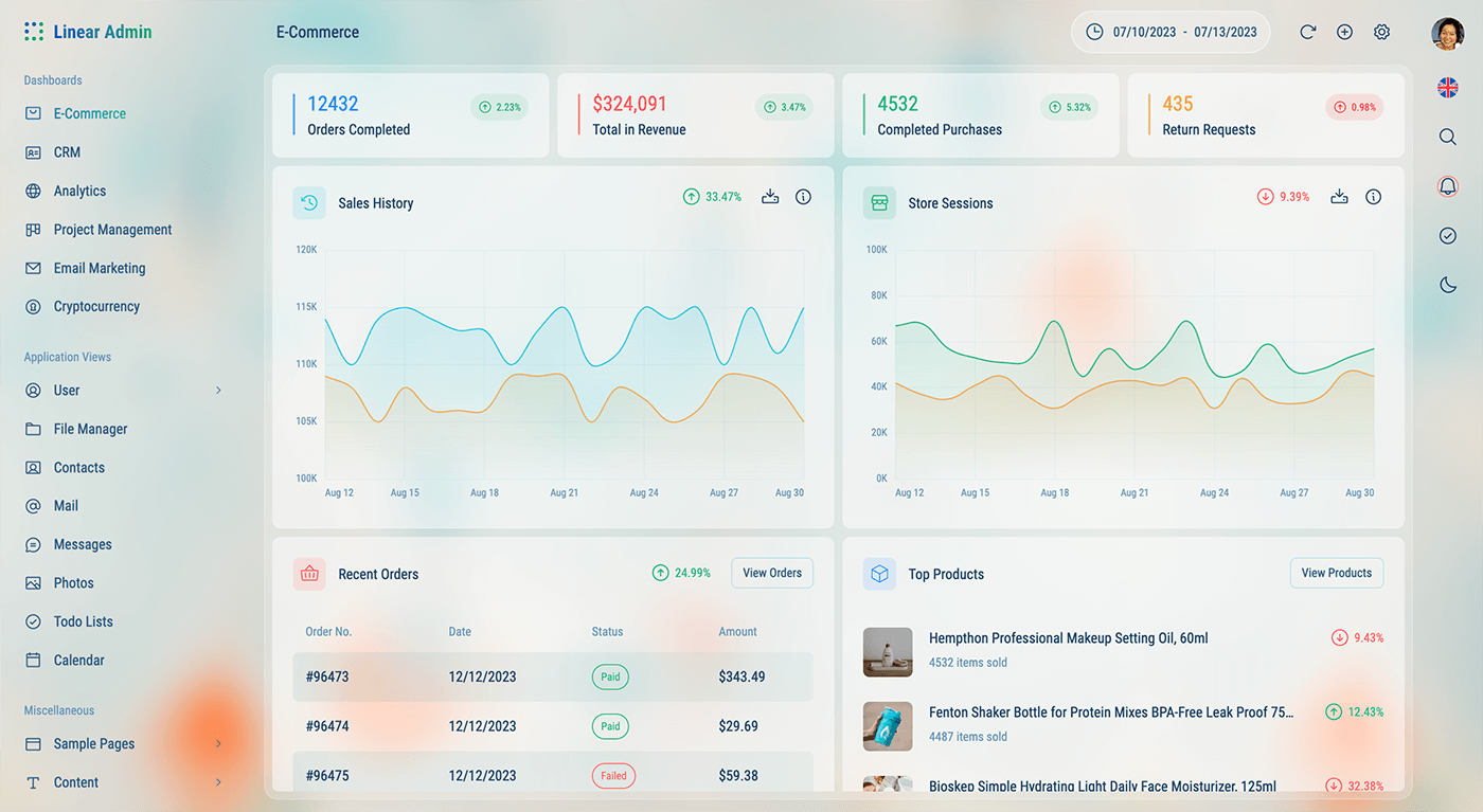
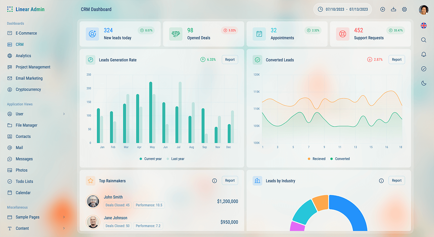
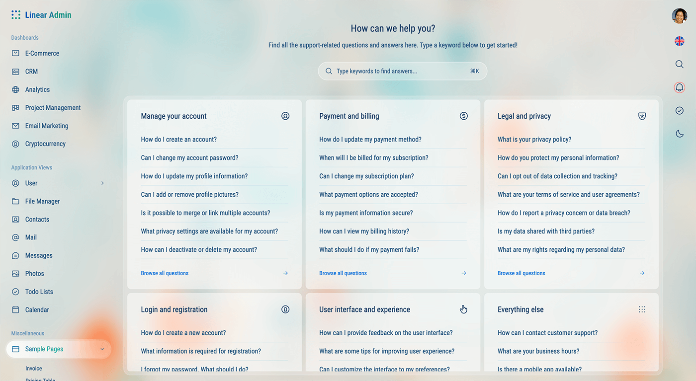
The two column template is the most common layout used in Linear Admin. It has a sidebar on the left and a body on the right. The sidebar is used for navigation and the body is used for the main content of the page.
import { Content } from "@/components/layout/content/content";
import { Header } from "@/components/layout/header/header";

const Page = () => {
	return (
		<>
			<Header title="[Header Title]">
				{/* Header content goes here... */}
			</Header>
			<Content>
				{/* Page content goes here... */}
			</Content>
		</>
	);
};

export default Page;
Three Column - Sidebar, Content-sidebar and Body
The three-column template is employed when you want to showcase a content-level sidebar on the left side of the page. This is particularly handy when you need to present a list of items on the left and the main content on the right.
How it works:
- This layout shrinks the default sidebar, which contains the menu, to create space for the content-sidebar. This is achieved by adding the
shrunk: trueproperty to the respective route insidebar-data.tsx, where all the route data is stored. - A separate component is created for the content-sidebar, and it is placed within the Content component using the
sidebarprop. - A button with
toggleContentSidebar()(fromuseSidebarhook) onclick function is used to toggle the content-sidebar on mobile and smaller screens. - In mobile devices and smaller screens, only the content body is shown, and you can toggle the content-sidebar by clicking the toggle button mentioned previously.
Four Column - Sidebar, Content-sidebar, Content-list and Body
Like the three column layout, the four column layout is also a combination of the sidebar, content sidebar and body sections. The difference is that the four column layout also includes an additional section for a third sidebar.
How it works:
- Follow the first 4 steps as described previously in the 3 column layout.
- A separate component is created for the content-list, and it is placed within the Content component using the
listprop. - On mobile, the content-list and body are displayed one at a time and can be toggled by clicking each content-list’s list-item or the back button with with onclick function
toggleCard()(fromuseContenthook) found on the body. - The sliding animation used to toggle between the content-list and body (on mobile) is achieved with the help of TailwindCSS’s
groupstate class.
No Columns - Body only
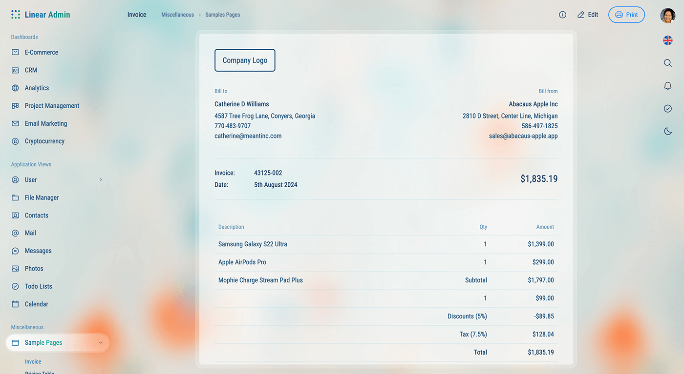
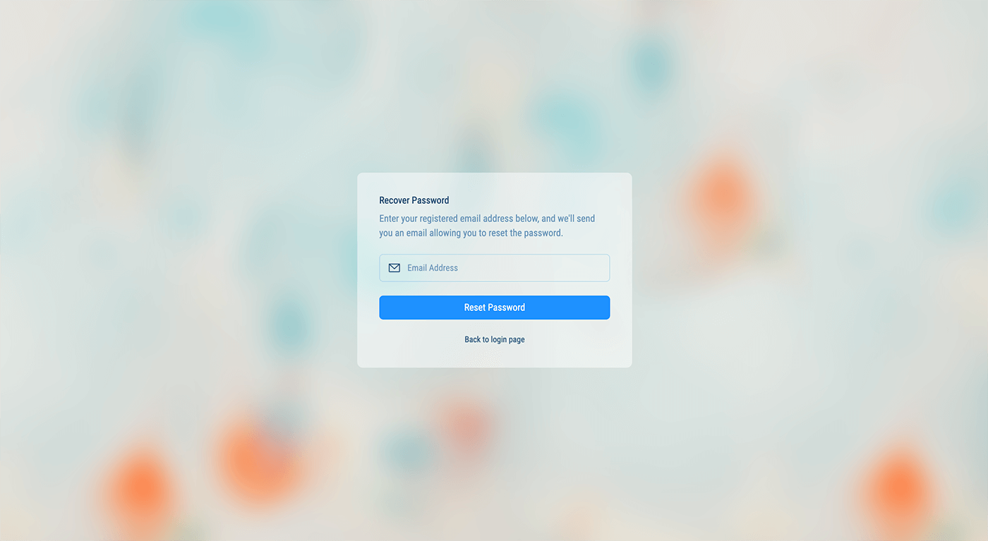
No columns layout is a simple layout with only the body content. It is useful for pages that don’t need a sidebar or a list.
import { Content } from "@/components/layout/content/content";

const Page = () => {
	return (
		<Content size="box" fill={true} padding={true}>
			{/* Page content goes here... */}
		</Content>
	);
};

export default Page;
